

What if your status page actually increased your support volume during an outage? A status page that looks like a marketing landing page fails its primary mission: technical transparency.
Effective status page design examples prioritize high-density technical data over marketing aesthetics to provide immediate clarity. By isolating affected components and providing a real-time incident timeline, these designs reduce user anxiety and eliminate redundant support queries.
We agree that your status page should be a functional extension of your SRE workflow, not a source of hidden costs like per-subscriber fees. It's frustrating to fight a bloated interface while your services are down. This review analyzes real-world patterns to help you build a hub that maintains technical credibility. We will move quickly from the logic of information hierarchy to architectural decisions like data sovereignty and EU hosting. Our goal is a communication hub that is straightforward, reliable, and easy to understand.
Key Takeaways
- Analyze various status page design examples to choose between minimalist and modular patterns based on your system architecture.
- Learn how to structure incident updates to reduce support ticket volume and maintain user trust during critical outages.
- Understand why hosting your status page on independent infrastructure is a mandatory requirement for technical reliability.
- Evaluate the impact of data sovereignty and regional hosting on your compliance strategy and user perception.
- Discover how to integrate automated monitoring with public communication to eliminate manual update delays.
The Anatomy of a High-Trust Status Page
A status page is a technical communication hub. It bridges the gap between your internal monitoring metrics and your user's browser. High-trust status page design examples prioritize information density over aesthetic fluff. Your page should act as a functional extension of your SRE workflow, providing immediate clarity when systems fail.
Trust begins with a reliable "System Normal" baseline. A minimalist design for the operational state reduces user anxiety by providing a single, unmistakable point of confirmation. Before an incident occurs, your page should establish credibility through historical uptime charts. These charts provide a transparent record of how you adhere to your service-level agreement (SLA) over time.
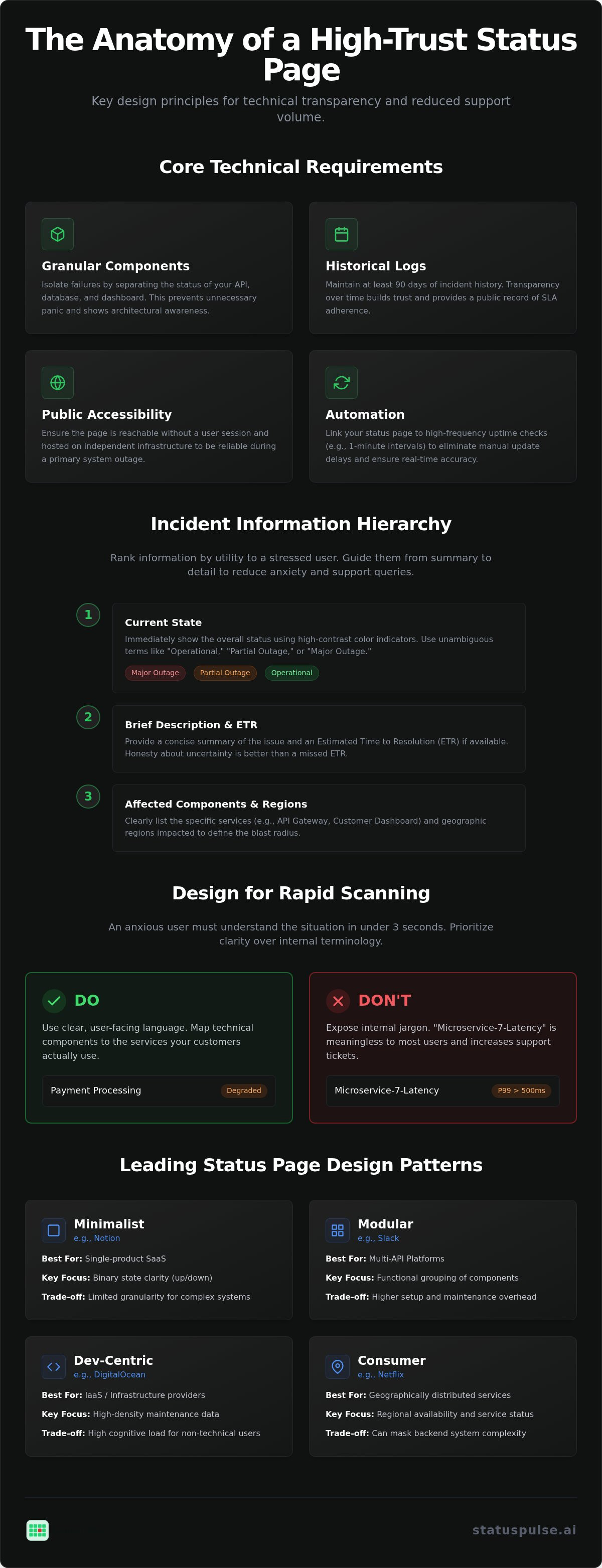
Every high-trust page should meet these core technical requirements:
- Granular Components: Separate your API, database, and dashboard statuses.
- Historical Logs: Maintain at least 90 days of incident history.
- Public Accessibility: Ensure the page is reachable without an active user session.
- Automation: Link your page to 1-minute uptime checks for real-time accuracy.
Component-level reporting is superior to global indicators for modern SaaS. It allows you to isolate a failure in a specific microservice while confirming that other parts of the platform remain healthy. This prevents unnecessary panic and shows you have a deep understanding of your own architecture. A technical component definition often looks like this in a structured configuration:
{
  "component_name": "API Gateway",
  "status": "operational",
  "uptime_90_days": 99.99,
  "region": "eu-central-1"
}
Information Hierarchy During an Incident
When services fail, information must be ranked by its utility to a stressed user. Start with the current state using high-contrast color indicators. Follow this immediately with a brief incident description and an estimated time to resolution (ETR). Finally, list the specific affected components and geographic regions to define the blast radius. Incident transparency is the balance of technical detail and user clarity that allows a customer to understand a failure without needing to contact support.
Reducing Cognitive Load for Stressed Users
Cognitive load increases during an outage. Your design must account for this by using color-coded bars for rapid scanning. A user should understand the situation in less than three seconds. Avoid internal jargon in top-level headers. Instead of "Microservice-7-Latency," use "Payment Processing." This ensures your message is accessible to both developers and non-technical stakeholders. Platforms like StatusPulse help achieve this by automating data flow into a clean, technical interface.
Analysis of Leading Status Page Design Patterns
Architecture dictates your communication style. A monolithic application requires a different approach than a global microservice mesh. When evaluating status page design examples, you must choose a pattern that aligns with your system complexity and user expectations.
| Pattern | Best For | Key Technical Focus | Trade-off |
|---|---|---|---|
| Minimalist (Notion) | Single-product SaaS | Binary state clarity | Limited granularity |
| Modular (Slack) | Multi-API Platforms | Functional grouping | Higher setup overhead |
| Dev-Centric (DigitalOcean) | IaaS / Infrastructure | Maintenance density | High cognitive load |
| Consumer (Netflix) | Regional services | Geographic availability | Masks backend depth |
The table above summarizes how industry leaders structure their transparency. Each pattern serves a specific technical audience. Choosing the wrong one can lead to user confusion or increased support tickets during a P1 event.
Pattern 1: The Component-First Layout
Grouping services by functional area helps users identify the blast radius of an incident. Effective groups often include API, Dashboard, and Database layers. This layout is vital for complex cloud architectures where one microservice might fail while others remain healthy. Handling a "Partial Outage" correctly prevents unnecessary panic for users on unaffected nodes. Clear, component-specific labeling ensures that a database migration doesn't look like a total platform collapse. If you want to avoid manual configuration, integrated status page solutions can automate these groupings based on your monitoring data.
Pattern 2: The Timeline-Driven Update
Incident logs must follow a reverse-chronological order to put the latest data at the top. This is the first place an SRE looks during an active event. Timestamps should use UTC to maintain a technical standard across global teams. Providing a local timezone toggle improves the experience for non-technical stakeholders. Managing long-running incidents requires a strategy to prevent UI clutter. Keep the interface clean by summarizing previous steps while keeping the full historical log accessible for post-mortem analysis. This approach maintains transparency without forcing users to scroll through days of data to find the current status.
Architectural Trade-offs: Hosting and Data Sovereignty
Status pages must exist outside your primary production environment. If your main application relies on a specific AWS region, your status page should live on a separate provider or in a different geographic zone. Many status page design examples fail because they ignore this dependency. When your core infrastructure collapses, your communication tool must remain reachable to prevent a total information blackout.
Latency also impacts user perception. A slow-loading status page suggests that your team is overwhelmed or that the failure is more systemic than reported. Technical users often check your status via terminal commands or automated scripts. High latency can trigger false negatives in their own monitoring tools, compounding the confusion. Your choice of architecture should prioritize a lightweight, fast-loading interface that functions under heavy load.
Choosing between a DIY approach and a dedicated SaaS provider involves clear trade-offs. Building a status page on a $5 VPS gives you full control but requires ongoing SRE maintenance. When analyzing status page design examples, it's evident that dedicated SaaS providers handle the redundancy for you. However, many industry incumbents include corporate bloat and complex pricing models that scale poorly as your subscriber count grows.
Regional Hosting and Compliance
Data sovereignty is a growing requirement for enterprise procurement. European companies often prioritize EU-based hosting to simplify GDPR compliance. While the law allows for data transfers with proper safeguards, hosting data within the EEA is the lowest-risk path for protecting user privacy. Cumulative GDPR fines have surpassed €7.1 billion as of 2026, making this an architectural decision rather than a legal afterthought.
Dedicated providers often cost more than a self-hosted script, but they save significant engineering time. A principled provider will offer a choice between EU and US hosting without extra fees. This allows you to align with regional regulations while keeping your status page close to your user base. It's a matter of ethics and technical precision to ensure your data resides where your users expect it to be.
Redundancy and Uptime of the Status Page Itself
You must solve the "who monitors the monitor" problem. A status page that goes down during a DNS or CDN failure is useless. Reliable systems use independent DNS providers to ensure the status URL remains resolvable even if your primary domain is under a DDoS attack. You don't want your status page to share a fate with the very system it's supposed to report on.
For a deeper look at building these systems, see our Uptime Monitoring: A Developer’s Guide. At StatusPulse, we address these trade-offs by providing 1-minute uptime checks and flat pricing. We don't charge per-subscriber fees, which removes the financial penalty for being transparent with your entire user base. This model respects your budget while ensuring your communication hub stays independent of your core app infrastructure.
How to Design for Lower Support Volume
A primary goal of incident communication is to eliminate "Is it just me?" queries. When a service fails, users naturally flood support channels to confirm if the issue is local or systemic. Effective status page design examples solve this by placing a clear, high-contrast banner at the top of the page. This immediate visual confirmation stops the ticket before it's even written. It respects the user's time and reduces the cognitive load on your support team.
Prominent "Subscribe to Updates" buttons are essential. If a user can easily opt-in to notifications, they're less likely to refresh the page or contact your team for updates. For technical users, providing RSS feeds and Webhook notifications is a high-value move. These tools allow them to integrate your status into their own internal workflows, treating your communication as a data feed rather than a manual check. Transparent design turns a potential support crisis into a self-service information hub.
The Subscription UX
Users have different preferences for how they receive bad news. Email remains the baseline, but Slack and SMS are often preferred for critical infrastructure updates. You must manage subscriber churn carefully. After an incident is resolved, some users will inevitably unsubscribe. This is a natural part of the lifecycle and should be as easy as the signup process. A complex unsubscription flow only damages your technical credibility.
Many industry incumbents set a "per-subscriber" pricing trap. For example, Atlassian Statuspage charges $399/month for 5,000 subscribers, while Status.io charges $349/month for the same count. This model effectively punishes you for being transparent with a large user base. We believe in a more ethical approach. At StatusPulse, we offer flat pricing with no per-subscriber fees, ensuring your costs stay predictable regardless of how many people you need to inform.
AI-Assisted Incident Communication
Writing incident summaries under pressure is difficult. Technical teams often struggle to find the right balance between technical detail and non-alarming language. AI incident management helps by drafting clear summaries based on your internal logs. This allows your responders to focus on the fix while the AI acts as an assistant to handle the initial communication draft. It removes the "blank page" problem during high-stress P1 events.
Consistency is key when multiple people are responding to an incident. AI ensures that the voice remains professional and calm, regardless of who is on call. For a deeper dive into this process, read our guide on How to Draft Honest Incident Updates with AI. By utilizing AI incident management, you can maintain a high standard of transparency without slowing down your recovery efforts.
Implementing Your Design with StatusPulse
Implementing your chosen design pattern shouldn't be a multi-week engineering project. We've reviewed several status page design examples, from minimalist to modular. StatusPulse provides the technical infrastructure to deploy these patterns without the corporate bloat typical of industry incumbents. We're a small, dedicated team focused on precision. Our public status pages are clean, technical, and reliable. You can configure component-level monitoring in under five minutes. This speed allows your team to focus on resolution rather than dashboard maintenance.
Leveraging AI incident management adds a layer of precision to your communication. The AI acts as a technical assistant, drafting updates based on your monitoring data. You maintain final human agency over every post. This ensures your voice remains grounded and honest. AI helps remove the stress of finding the right words during a P1 outage. While competitors like Atlassian charge [VERIFY: Atlassian Statuspage entry price] or scale costs based on subscribers, we use a flat pricing model. You don't get penalized for growing your audience or being transparent during a crisis. It's a fair way to do business.
Customization Without the Bloat
A status page is only as good as the data feeding it. StatusPulse syncs uptime monitoring directly with your public page. Our 1-minute uptime checks serve as the primary data source, ensuring your status is always accurate. This automation reduces the risk of human error during an incident. You can also integrate SSL certificate and API monitoring as proactive data sources. Monitoring your endpoints and certificates helps you catch issues before they require a public update. This all-in-one approach removes the friction of connecting multiple third-party tools. If you're ready to move away from complex, per-subscriber pricing, you can build your transparent status page with StatusPulse. We offer a reliable alternative for teams that value simplicity and ethical cost structures.
Building a Resilient Communication Hub
Incident transparency is an architectural requirement, not a visual preference. By reviewing various status page design examples, we see that the most effective pages prioritize data density and independent infrastructure. You must ensure your status page remains reachable when your core services fail. Choosing between EU and US hosting allows you to align with regional privacy standards while maintaining technical credibility. This approach reduces support volume by providing users with immediate, verifiable truth.
We provide a principled alternative to corporate-bloated tools. You get flat pricing with no per-subscriber fees and AI-powered incident management included. This ensures your communication stays honest and your costs stay predictable. You can start your free StatusPulse trial today to build a status page that respects your users and your budget. Your team deserves a tool that simplifies incident response without adding financial complexity. Reliable transparency is within your reach.
Frequently Asked Questions
What should be included on a professional status page?
High-contrast status indicators, component-level uptime data, historical performance charts, and a clear incident timeline are essential. You also need a prominent subscription button for email or Slack updates. Professional status page design examples often include maintenance schedules to prevent users from mistaking planned work for an outage. These elements combine to create a source of truth that reduces support volume and builds technical credibility with your user base.
How do I choose between a public and a private status page?
Choose a public status page if your service is used by external customers who need real-time transparency to maintain their own workflows. Public pages are essential for SaaS and API providers. Use a private status page for internal infrastructure that only your engineering or support teams need to monitor. Private pages often require SSO or IP whitelisting. Many teams maintain both to separate high-level customer communication from granular internal debugging data.
What is the best URL for a status page?
Use a dedicated subdomain like status.yourcompany.com. This is the industry standard and makes the page easy for users to find during a crisis. Ensure this subdomain is hosted on a separate DNS provider from your primary application. If your main domain's DNS fails, your status page must remain reachable. Avoid using subdirectories like yourcompany.com/status, as these often share the same infrastructure and failure points as your main site.
Can I automate status page updates from my monitoring tool?
Yes, you can automate updates by connecting your uptime monitoring directly to your status page. This ensures that the page updates within seconds of a detected failure, removing the delay of manual reporting. Tools like StatusPulse use 1-minute uptime checks as a data source to trigger these changes automatically. Automation reduces human error during high-stress incidents but should still allow for manual overrides and AI-assisted descriptions to provide necessary context for users.
How often should I update the status page during an outage?
Update the page every 15 to 30 minutes during a major outage, even if you don't have a final resolution. Silence creates anxiety and drives users toward your support tickets. A quick "We are still investigating the root cause" is better than no update at all. Frequent, honest communication proves that your team is actively working on the fix. Once the issue is resolved, provide a brief summary of the recovery steps taken.
Does a status page help with SEO or brand trust?
A status page primarily builds brand trust by demonstrating accountability and technical maturity. While it doesn't directly boost search rankings for your main product, it protects your brand's reputation when users search for your service's current state. Reviewing status page design examples shows that clear communication during downtime prevents negative social media sentiment. It signals to enterprise prospects that you have a mature incident response process and respect their data sovereignty.
What are the common mistakes in status page design?
Common mistakes include hiding the "All Systems Operational" message, using overly technical jargon that confuses non-engineers, and failing to provide a subscription option. Another major error is hosting the status page on the same infrastructure as the application it monitors. This creates a single point of failure. Finally, many teams forget to include local timezones in their incident logs, which makes it difficult for global users to understand the timeline of events.


