
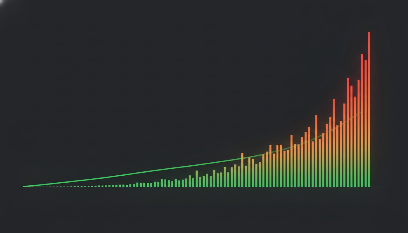
Your dashboard is green, but your users are frustrated. It's a common trap. A checkout API might show a 150ms average latency while one in twenty customers waits five seconds to pay. Averages are mathematical fictions. They smooth over the exact failures you need to catch. You need Latency That Tells the Truth with p50 Percentiles Instead of Misleading Averages to see the reality of your production environment. If you serve 10 million requests a day, a healthy average can easily hide 100,000 slow experiences.
We know the frustration of "green" metrics that ignore real user pain. It makes explaining system performance to non-technical stakeholders nearly impossible. This article explores the math of percentiles and explains why the mean is a dangerous metric for modern, distributed systems. You'll learn how to implement p50, p95, and p99 percentiles to achieve honest system observability. We'll show you how to configure monitoring that respects the user experience and eliminates the noise of inaccurate alerting. By the end, you'll have a blueprint for building trust through transparent, reliable latency reporting.
Key Takeaways
- Mean latency is a mathematical fiction that hides outliers. Learn why right-skewed distributions require a more precise approach than the arithmetic average.
- Distinguish between p50, p95, and p99 to map the full range of user experiences. This allows you to identify the specific threshold where performance issues impact your most critical journeys.
- Discover how to achieve Latency That Tells the Truth with p50 Percentiles Instead of Misleading Averages by avoiding the coordinated omission trap. Traditional tools often ignore the very stalls they are meant to measure.
- Transition from vanity dashboards to actionable SLIs and SLOs. Configure monitoring that triggers alerts based on persistent percentile degradation rather than transient spikes.
- Foster transparency by sharing percentile data with non-technical stakeholders. Honest reporting on public status pages builds long-term trust even during service disruptions.
The Statistical Illusion: Why Average Latency Lies to You
Your monitoring tools are likely lying to you. Most developers rely on the arithmetic mean to judge system health. This is a mistake. Latency is not a bell curve; it is a right-skewed distribution. While most requests are fast, the outliers are often orders of magnitude slower. The average is a poor representative of reality because it is highly sensitive to these extreme values.
The Math of Skewed Distributions
In networking, we deal with Power Law distributions rather than Gaussian ones. The arithmetic mean is mathematically fragile. A single massive value pulls the entire average toward it, creating a number that describes zero actual users. If you have a tail latency spike of 10 seconds in a pool of 100ms requests, the average shifts significantly.
The result is a metric that is too high for your fast users and too low for the user who timed out. For a Site Reliability Engineer, the average is a metric that describes everyone but represents no one. You need a measurement that ignores the noise of the mean. This is where you find Latency That Tells the Truth with p50 Percentiles Instead of Misleading Averages.
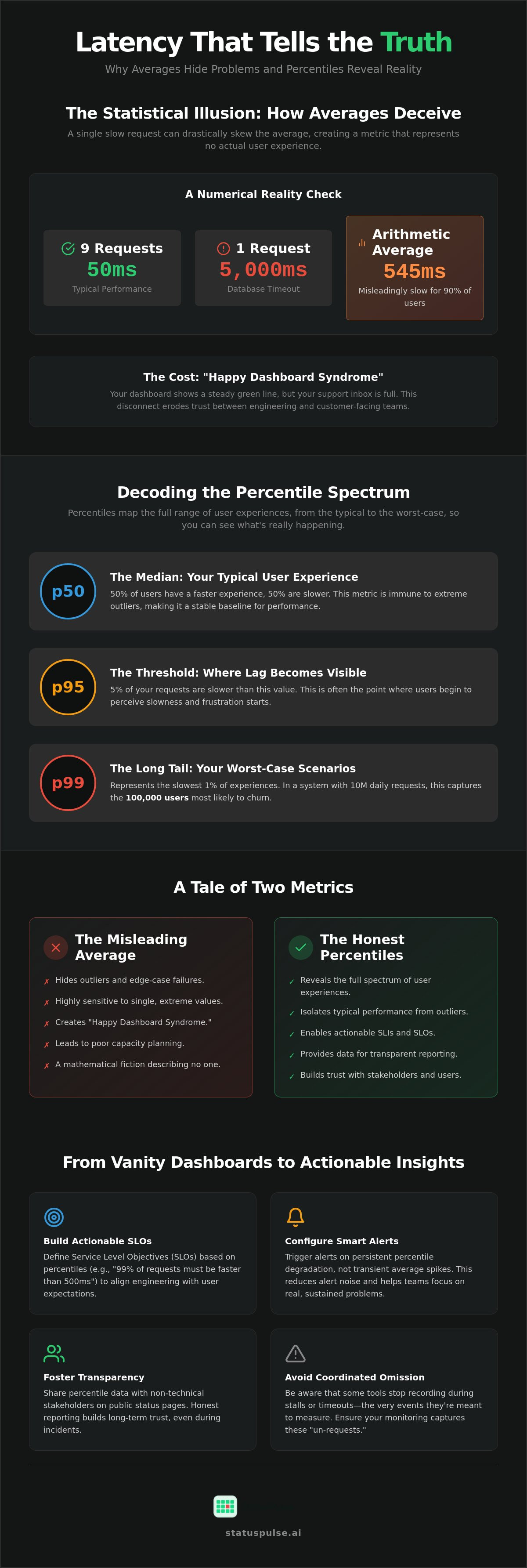
- Request 1-9: 50ms (Typical performance)
- Request 10: 5,000ms (Database timeout or cold start)
- Arithmetic Average: 545ms
In this example, the average is ten times slower than what 90% of your users feel. It suggests a systemic slowdown when there is actually a single catastrophic outlier. Relying on this data leads to chasing ghosts in your code while ignoring the specific bottleneck affecting that tenth user.
The Cost of Misleading Metrics
Using averages creates "Happy Dashboard Syndrome." Your monitoring tool shows a steady, acceptable green line while your support inbox fills with complaints. This gap destroys the relationship between engineering and customer success teams. When developers claim the system is fine because the average looks good, they're ignoring the 1% of users facing total failure.
Inaccurate metrics also ruin capacity planning. If you scale based on average load, you'll consistently under-provision for the bursts that actually matter. High-performance teams ignore the mean and focus on the distribution. You can get Latency That Tells the Truth with p50 Percentiles Instead of Misleading Averages by using a status page and monitoring suite that highlights the long tail of your performance data. This transparency prevents regional outages from being washed away by global averages.
Decoding the Percentile Spectrum: p50, p95, and p99
Stop looking at the mean. The arithmetic mean is a ghost that haunts your dashboards without representing a single real person. To understand how your system actually performs, you must view latency as a spectrum. Percentiles provide Latency That Tells the Truth with p50 Percentiles Instead of Misleading Averages. They allow you to categorize users based on their specific experience rather than a mathematical blur.
The p50, or median, is your most stable anchor. It represents the exact middle of your request distribution. If your p50 is 150ms, half of your users are experiencing faster response times, and half are slower. Unlike the average, the p50 is immune to extreme outliers. A single 30-second timeout won't budge your median, but it will spike your average. This makes p50 the most reliable metric for understanding the typical user experience.
As you move up the spectrum, p95 and p99 reveal the "long tail" of performance. The p95 threshold is where lag becomes visible to the majority of your users. It signifies that 5% of your traffic is slower than this value. The p99, or tail latency, represents the worst-case scenario. In a system serving 10 million requests a day, a p99 measurement captures the 100,000 slowest experiences. These are the users most likely to churn, yet they are completely invisible to those relying on averages.
When to Care About p50
Use p50 for baseline performance regression testing. It's the best tool for spotting systemic architectural bottlenecks. If your p50 rises steadily over a week, you don't have a few slow requests; you have a fundamental efficiency problem. It is also critical for regional comparisons. If your US-based users have a 100ms p50 while your EU users are at 400ms, you likely have a data sovereignty or routing issue that needs attention. Monitoring these baselines helps you build trust through transparent latency reporting that reflects the typical journey.
The Significance of Tail Latency (p99)
Tail latency is rarely caused by your core logic. It's usually the result of environmental factors like garbage collection pauses, serverless cold starts, or network hops. In microservice architectures, p99 has a compounding effect. If a single user request hits ten different services, and each has a 1% chance of being slow, that user has a nearly 10% chance of experiencing tail latency. This is the fan-out effect. While p99.9 is often overkill for non-financial applications, ignoring your p99 means ignoring thousands of frustrated customers every day.
The Coordinated Omission Trap in Latency Monitoring
Switching to percentiles is only half the battle. Your data can still be fundamentally flawed if your monitoring tool falls into the trap of coordinated omission. This occurs when a testing tool waits for a slow request to complete before it schedules the next one. If your system stalls for 30 seconds, a naive monitor simply sits idle, waiting for a response. It effectively stops measuring the system exactly when the system is failing most spectacularly.
This leads to a massive underreporting of tail latency. Your p99 might look like 500ms on your dashboard, but the reality for users during a stall could be 30 seconds or more. Because the tool was "busy" waiting, it didn't record the thousands of requests that would have failed or timed out during that window. You end up with a sanitized version of history that protects the feelings of the engineering team but ignores the reality of the customer experience.
To get Latency That Tells the Truth with p50 Percentiles Instead of Misleading Averages, you must use tools that employ independent scheduling. Professional monitoring should fire probes at a fixed rate, regardless of when the previous request finished. This is the only way to capture the full distribution of performance. Without it, your synthetic monitoring is just a "waiting for Godot" exercise where you miss the very spikes you are trying to find.
How Independent Probing Solves the Omission Problem
Independent probing ensures that your sampling rate remains constant. If you configure a check to run every 60 seconds, it must fire at that interval even if the previous probe is still hanging. This prevents the "omission" of data during system-wide slowdowns. You can verify if your current uptime monitor is omitting data by checking if it records multiple overlapping failures during a major outage. If it only shows one long, continuous block without capturing the specific latency of each attempt, it is likely misleading you.
Segmenting Latency by Dimension
Global percentiles often hide local truths. A healthy global p50 can mask a complete regional failure in EU-West if your US traffic is significantly higher. To achieve true observability, you must segment your data by region, traffic type, and endpoint. Tracking latency per API endpoint is particularly valuable for identifying which specific service is dragging down the overall system performance.
- Regional Segmentation: Essential for verifying performance across different hosting locations, such as EU vs US.
- Auth vs Unauth: Authenticated requests often hit databases and caches differently than public traffic.
- Endpoint Specifics: A slow /checkout endpoint is a business crisis; a slow /about page is a minor ticket.
By breaking down your metrics this way, you ensure that your API monitoring provides the granular detail needed to solve problems quickly. It moves the conversation from "the system is slow" to "the login endpoint in the London region is hitting p99 thresholds."
Implementation: Building SLOs and Dashboards That Matter
Moving from theory to practice requires a shift in how you store and alert on performance data. You cannot simply average your percentiles across different nodes or time intervals. Mathematically, the average of p99s is not a p99. To achieve Latency That Tells the Truth with p50 Percentiles Instead of Misleading Averages, you must implement a structured workflow for your observability stack.
- Step 1: Define Service Level Indicators (SLIs). Choose specific metrics like p95 or p99 for your most critical endpoints. Don't measure everything; focus on the user journeys that drive revenue.
- Step 2: Set Realistic Service Level Objectives (SLOs). Base these on your current p50 baseline. If your typical response is 200ms, a p95 SLO of 500ms is a reasonable starting point.
- Step 3: Use Histograms. Stop using Gauges for latency. Histograms store data in buckets, allowing you to aggregate percentiles accurately across multiple clusters or regions.
- Step 4: Alert on Burn Rates. Don't trigger a page for a single p99 spike. Configure alerts to fire when your "error budget" is depleting at an unsustainable rate over a window of 15 to 60 minutes.
Integrating with OpenTelemetry and Prometheus
Modern stacks rely on OpenTelemetry for instrumentation and Prometheus for storage. In Prometheus v3.13.0, you'll use the histogram_quantile function to calculate real-time percentiles from your bucketed data. A typical PromQL query for p95 latency looks like this: histogram_quantile(0.95, sum by (le) (rate(http_request_duration_seconds_bucket[5m]))). This approach ensures your data remains accurate even as you scale horizontally.
Choosing between client-side and server-side measurement involves trade-offs. Server-side metrics miss the "last mile" of network latency, while client-side data can be noisy. For those who want a balanced view without the configuration bloat, StatusPulse provides native API monitoring that handles these percentile calculations out of the box. This allows you to focus on resolving incidents rather than debugging your math.
Data Sovereignty: EU vs US Monitoring Nodes
Where you monitor from is as important as what you monitor. If your users are in Berlin but your monitoring nodes are in Northern Virginia, your p50 will be permanently skewed by the 100ms trans-Atlantic round trip. This "network tax" makes it impossible to find Latency That Tells the Truth with p50 Percentiles Instead of Misleading Averages. You need local probes to separate application slowness from unavoidable physics.
Regionality also impacts compliance. Under GDPR, keeping your monitoring traffic and performance logs within EU borders is a matter of data sovereignty. Cross-Atlantic network jitter can also artificially inflate your p99 metrics, leading to false positives in your alerting. By using a monitoring suite that offers a choice between EU or US hosting, you ensure your metrics are both legally compliant and technically accurate. To start measuring your system with regional precision, configure your first uptime monitor today.
Transparency in Practice: Communicating Latency to Stakeholders
Binary status indicators are no longer enough. A "100% Uptime" badge loses all meaning when your API is technically reachable but takes ten seconds to respond. Users don't care about your server's heartbeat if the interface is frozen. Hiding behind vanity metrics backfires the moment a customer experiences a slow checkout or a hanging dashboard. It creates a gap between your reported health and the actual user experience.
The Architecture of an Honest Status Page
An effective status page should go beyond a simple green checkmark. Displaying p50 or p95 charts directly to your users provides immediate context during a slowdown. If your p99 spikes while your p50 remains stable, you can accurately label the event as "minor degradation" affecting a small subset of users. This prevents widespread panic and shows that your team has a surgical understanding of the incident.
Transparency requires a structured approach to data presentation. You must balance technical depth with accessibility. For a deeper look at how to structure these communications, see The Architecture of Incident Communication Transparency. Providing this level of detail ensures that your technical peers can verify your claims, which is the foundation of professional trust.
Reducing Support Volume with Proactive Alerts
Support tickets often flood in because users are left in the dark during performance dips. You can eliminate this friction by automating status updates when your latency SLOs are breached. Modern tools use AI to summarize complex latency incidents into plain language for non-technical stakeholders. This ensures everyone from the CEO to the end-user understands what is happening without requiring a manual update from an exhausted engineer.
Positioning your brand as a transparent partner is a strategic move. While legacy providers might hide their tail latency to protect their reputation, a principled team shares the data. This honesty reduces churn because customers feel respected rather than managed. To move beyond mathematical fictions and start providing real observability, build trust with transparent uptime and latency monitoring. It's time to stop reporting averages and start reporting the truth.
Building a Culture of Technical Integrity
Averages are a mathematical convenience that hide the reality of your production environment. By moving to percentiles, you stop optimizing for a fictional "mean" user and start seeing the specific bottlenecks affecting your most critical journeys. This transition is the only way to achieve Latency That Tells the Truth with p50 Percentiles Instead of Misleading Averages. It allows your engineering team to catch "fake green" dashboards before they lead to customer churn or alert fatigue.
True observability requires more than just better math; it requires a platform built for precision. StatusPulse offers native p50, p95, and p99 monitoring with the added benefit of EU-based data sovereignty for strict regional compliance. Our AI-powered incident summaries translate technical spikes into clear, actionable updates for your stakeholders, ensuring that your transparency is as efficient as your code. You've done the hard work of building a reliable system. Now, it's time to give it the transparent reporting it deserves.
Stop guessing and start monitoring with StatusPulse.
Frequently Asked Questions
What is the difference between p50 latency and average latency?
The p50 latency is the median value where exactly half of your requests are faster and half are slower. Average latency is the arithmetic mean, which is easily skewed by a few extremely slow requests. Using p50 provides Latency That Tells the Truth with p50 Percentiles Instead of Misleading Averages because it focuses on the typical experience rather than a mathematical blur influenced by outliers.
Why is p99 latency often called "tail latency"?
The p99 metric is called tail latency because it measures the "long tail" of a probability distribution where the slowest 1% of requests reside. These requests often involve complex edge cases like database lock contention, cold starts, or garbage collection pauses. While these events are rare, they define the worst-case experience for your most unlucky users and are the primary cause of customer churn.
Can I average percentiles from different servers to get a global view?
No, you cannot mathematically average percentiles from multiple servers to get a global view. An average of p99s does not result in a global p99 because the underlying distributions have different request volumes and shapes. To aggregate this data correctly, you must use histograms or sketches that allow for mergeable summaries across your entire cluster without losing the distribution's integrity.
Which percentile is best for setting an SLO?
The p95 or p99 percentiles are generally best for Service Level Objectives (SLOs) because they capture the experience of users who are actually feeling performance pain. While p50 is excellent for baseline health, it doesn't trigger alerts when a small portion of users face catastrophic delays. Most high-performance teams set SLOs at p95 to ensure that 19 out of 20 requests meet a specific performance target.
What is coordinated omission and how does it affect my metrics?
Coordinated omission occurs when a monitoring tool waits for a slow request to finish before sending the next one. This creates a dangerous blind spot during system stalls, effectively hiding the most significant latency spikes from your reports. You need a monitor that uses independent scheduling to fire probes at a fixed interval regardless of the response time of previous checks to ensure your data reflects reality.
How does network latency differ between EU and US hosting regions?
Network latency between the EU and US is primarily limited by the speed of light, resulting in an unavoidable round-trip time (RTT) of roughly 60ms to 100ms. If your monitoring nodes are in a different region than your users, this "network tax" will artificially inflate your p50 and p99 metrics. Choosing a provider that offers hosting in both regions is critical for maintaining accurate performance data and meeting GDPR data sovereignty requirements.
Is p99.9 latency actually worth tracking for a standard SaaS?
For most standard SaaS applications, p99.9 is often overkill and can lead to excessive alert noise that causes team burnout. Tracking p99.9 is generally reserved for high-frequency trading or massive scale systems where one in a thousand requests still represents thousands of concurrent users. Most teams find better ROI by focusing on Latency That Tells the Truth with p50 Percentiles Instead of Misleading Averages and using p95 for their primary alerts.
How can I display latency data on my public status page?
You can display latency data by embedding real-time p50 or p95 charts directly onto your public status page using a modern monitoring suite. This level of transparency builds trust by showing users that you are monitoring the actual quality of their experience rather than just binary uptime. Modern status pages also use AI to provide incident summaries, translating complex percentile spikes into plain language that non-technical stakeholders can understand.


